Kensington clubs are swish, swanky and full of London’s elite party-g...
A well designed and printed flyer can be used to help your audience make an informed decision about your business. The London Printing Company offers a professional flyer printing service that transforms promotional material into your best sales tools. Whatever idea or design you have in mind, we can transform it into a flyer that captures the imagination.
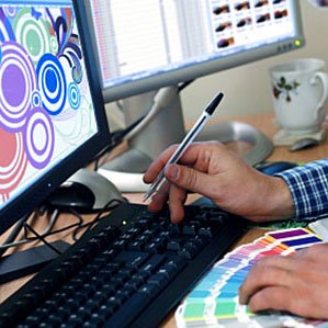
We’re not only specialists in printing flyers of the highest quality, but also in designed them. Our in-house designers would be thrilled to listen to your idea for your business’ next promotional flyer campaign. We can assist with deciding what basic layout would be the most efficient for your marketing campaign, as well as design the entire flyer based on your instructions. Otherwise, you’re welcome to provide the full design and we can go straight to the printing.
We can print your flyers in a variety of sizes, including the following:
- A4 flyers (size of a sheet of printing paper)
- A5 flyers (a smaller option that the A4)
- A6 flyers (an even smaller option, roughly the same size as a postcard)
You can order your flyers in any of these sizes, printed on either both sides or just a single side, as well as in full colour or black and white.
While the majority of promotional content is online these days, it’s very easy for important messages to get lost on the internet. This makes printing and distributing promotional flyers a great way to get the word out to very specific locations and target markets. But they still need to be carefully designed by following flyer best practises.
This video by Local Direct Network provides some basic tips on how to get your flyer to stand out.
The key thing to remember when designing a flyer is that ‘simplicity is key’. You want to be able to create an eye catching flyer without too many words that will attract people’s attention. This means that along with not having too much writing on your flyers, you’ll want to avoid having too many images as well, since this might confuse the reader as to where exactly they should be focusing their attention. A smartly worded heading with the perfect design elements and images is what will get the job done (high quality images tend to perform much better than blurry, lower quality images).
If the nature of your flyer requires a fair amount of text, then it’s important to segment the text into smaller sections which are easily consumable by the reader. If possible, the text should be simplified into bullet points as well, while not using too many different fonts (one or two different types of fonts should do the trick).
If you’re not entirely sure where to start, that’s okay. We’d love to hear from you and guide you as much as we can throughout this process. Feel free to send us a message, give us a call, or visit either of our London based stores in Notting Hill or Chelsea.


